
I enjoy reading the blog by Dr. Jeff Masters at Weather Underground. In a recent post, Bob Henson said that atmospheric CO2 had reached a new high value. His supportive evidence linked to the Keeling Curve data maintained at Mauna Loa in Hawaii by the Scripps Institution of Oceanography. Each day you visit the Keeling Curve page, the most recent CO2 value is posted above the charts.
The images in this gallery were each obtained by hovering my mouse pointer over the time spans below the chart. As you go through the gallery, notice the cyclical pattern evident in the 1 yr, 2 yr, and 1958-to-Now images. Also note the rapidly increasing trend toward higher CO2 levels in the 1700-to-Now image. The impact we humans have had on the levels through fossil fuel use during this era is quite apparent. The final image includes a huge span of time inclusive of several global warming and cooling episodes. None of those episodes had levels of CO2 near those of today.
Keeling Curve Gallery
-

- Recent week of CO2 values
-

- Recent month of CO2
-

- Recent 6 months
-

- Recent 1 year
-

- Recent 2 years
-

- 1958-to-Now
-

- 1700-to-Now | Industrial Era
-

- 800,000 yrs ago-to-Now
Global Monitoring of Greenhouse Gases
I’ve also been exploring the Earth System Research Laboratory – Global Monitoring Division to see what the data shows about greenhouse gas measurements, specifically Carbon Dioxide (CO2). The Earth System page looks like this screen capture below. It is an interactive map of monitored sites with many ways of displaying the data. Click it to visit the actual map and page.
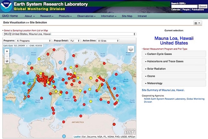
The default site is the Mauna Loa station in Hawaii which has maintained continuous CO2 measurements since 1958. Notice the drop down choices to the right of the map. If you follow the link of the map and click Carbon Cycle Gases, you get these following choices.
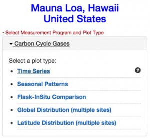
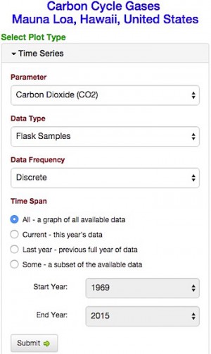
A click on Time Series will give you another set of options. For this post, I tried out the four Time Span options and plot types above to see what they yielded. What follows are some observations.
CO2 Shows Seasonal Variations
The Mauna Loa data from the middle of the Pacific Ocean for the recent 2 years shows this cyclical pattern. Global winds carry the gases of the atmosphere and mix them quite thoroughly by the time they reach Hawaii. During the May to September time span, vegetation is increasing in the northern hemisphere. Plants take in CO2 to produce energy and O2. The atmospheric levels of CO2 decrease. From October to April, much of the vegetation decreases or goes dormant causing the CO2 levels to rise. Each year the peak value of CO2 is higher than the previous year.
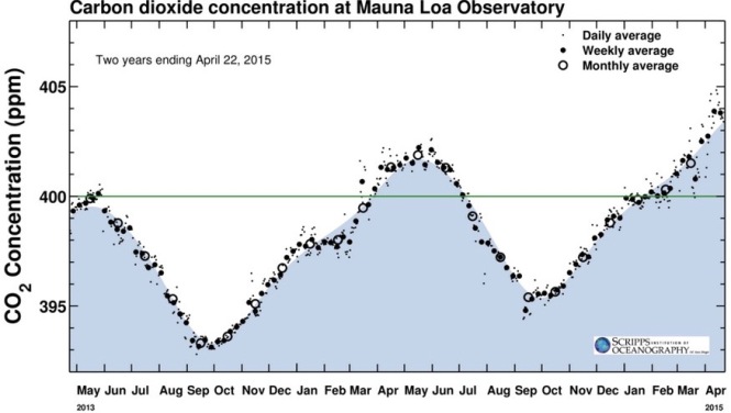
Recent 2 years of CO2
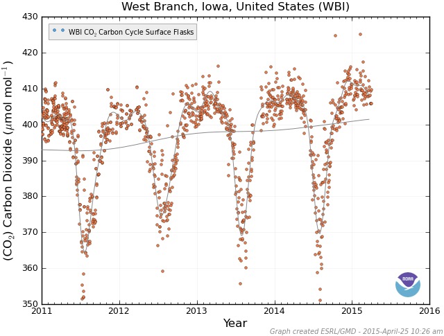
A Specific Iowa Example
Here is the seasonal variation curve for just over 4 yrs at a monitored site near me in east central Iowa. The air samples are from ground level. This site is in the middle of the agricultural heartland of the U.S. Notice how the plot drops sharply from April to July as the growing season occurs. It remains well below the grey line average due to photosynthesis until about October. During the winter months November to March, the CO2 levels are high. Vegetation is not using the CO2 in the atmosphere of the northern hemisphere.
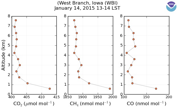
The Effect of Altitude
Data from the same Iowa site includes samples of gases from many different altitudes. A date of January 14, 2015 is used to illustrate this effect. That date would mean CO2 is at a peak value of about 413. The left-most chart shows the CO2 levels are less with higher altitude. High speed upper air patterns effectively mix the atmospheric gases. The more concentrated levels are found near ground level close to the decaying vegetation and soils. The same effect is shown for Methane CH4 and Carbon Monoxide CO.
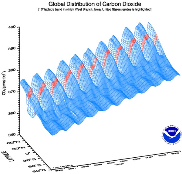
Northern and Southern Hemisphere CO2 Different
This 3-D chart needs some explanation in order to fully understand all it displays. The horizontal axis is time. It covers the span from 2000 to 2010. The vertical axis is CO2 levels measured at dates along the time axis. Notice the cyclical pattern year-to-year of increases followed by decreases. The data for the Iowa location is in red. Over time, the trend of the CO2 values is increasing from left to right as expected. Sites all over the world report this same increasing trend.
The third axis on the bottom of the chart is the global latitude north and south of sites monitored for this chart. Both hemispheres exhibit a cyclical pattern. The northern hemisphere CO2 levels are significantly larger due to the greater amount of vegetation.
There is one more subtle effect shown in this chart. The peaks and valleys of the southern hemisphere are offset 6 months from those of the northern hemisphere. It is hard to see without being able to rotate the chart.
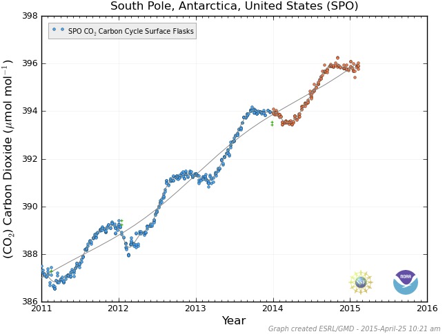
North Polar vs South Polar CO2 Changes
Comparison of two far north and far south stations is interesting. The one farthest north is at Alert, Nunavut, Canada 82.5˚N. According to the chart above, this station should see a large cyclical pattern from season to season. Here is their most recent data showing about a 15 point amplitude. Orange data points have yet to be certified.
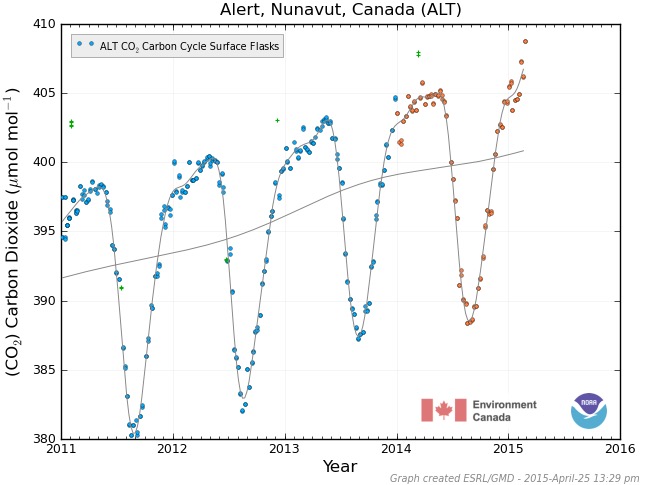
The one farthest south is at the South Pole Station. It shows a small variation from season to season of only a couple of points. Notice the offset of 6 months between the peaks and valleys of these two charts.
Conclusion
Most of us are aware of the trend toward rising CO2 levels. Fewer realize the wide extent of the data collected and the efforts to certify the validity of the data. I have found it very interesting how much information is available. Climate change is taking place. The data recordings are widespread and cover a wide range of time. I don’t understand how anyone who claims to have an open mind can claim it is not happening. If we have gone past the point of no return, we should still strive to develop ways to run our economies with less negative impact on the planet. It can be done.

Amen and hallelujah Jim!
Hey thanks.
Great use of graphs to understand what’s happening in the atmosphere. I’ll check out that interactive site. The many scales for historical global carbon dioxide are powerful – it’s easy to say it’s cyclical so no worries, but when you pull back and look at the long term, our anthropogenic effect is inescapably obvious. Thanks for the links and explanations.
If you have any questions as you explore the interactive site, don’t hesitate to ask for help. It took me a while to figure out a few features. It was worth it.
I agree, we are seeing the effect of our human activity very clearly. That curve is an increasing steepness in the next to last image. The last one shows it vertical on the right edge of that long time scale.
Thanks for your comments.
Really interesting. You’ve been talking about some of these data and sites for awhile. It was good to see it all in one place — gives a much clearer picture. Thanks for doing the hard work to make this very understandable — to those who want to understand.
Thank you, dear. I enjoyed bringing those ideas together. Glad it made sense. 🙂
great stuff Jim!
thanks for the links and an excellent article.
Thank you. I had fun putting this together. The more I dug into it, the more interesting stuff I found. Hard to know when to stop.
Good to see you.
I’ve been there 🙂
Did you see this one Jim?
https://www.sciencenews.org/blog/context/old-periodic-table-could-resolve-today%E2%80%99s-element-placement-dispute ?
I had not seen that. It appears Janet is an unsung character in that field. It isn’t likely the billions of periodic tables will get replaced with his version. Especially if it won’t fit on one sheet of paper. 🙂
When in stress, I turn to books and I have just come across a book called, “Hope Beneath Our Feet”, edited by Martin Keogh. It is a series of essays by several writers on how to live now. Each of us can respond to the myriad ways we humans are trashing the planet. There are so many scary things going on that it quickly becomes overwhelming. It is also easy to point fingers and judge when others don’t come onboard. We may well have passed the point of no return but I think it is still meaningful to find ways that we can do differently. As one author put it, if enough of us all lean together maybe we can tip the balance back the other way.
Thank you for your posts, Jim. They are so well-researched and put together.
I don’t want anyone to interpret my post as a message of hopelessness. I believe there are many ways we can all be of more help for our planet. It is clear there are many people who are not paying attention. My posts are a way to try getting some more to notice the problems. You, I am happy to say, are already there. 🙂 As in the Bill Withers song, Lean on Me, we all need to lean together. I like that.
I like that, too 🙂
And thanks again for the great posts~I hope many see them.
Quod erat demonstrandum.
Gratias ago vos pro lectio.
Jim, I see CO2 levels shows seasonal and altitude variations, but considering rainforests like the Amazon and other ones, CO2 levels remains stable in those areas throughout the year. What’s interesting is the North Polar vs South Polar CO2 changes. “Earth’s magnetic field serves to deflect most of the solar wind, whose charged particles would otherwise strip away the ozone layer that protects the Earth from harmful ultraviolet radiation….Humans have used compasses for direction finding since the 11th century A.D. and for navigation since the 12th century. Although the magnetic declination does shift with time, this wandering is slow enough that a simple compass remains useful for navigation. Using magnetoception various other organisms, ranging from soil bacteria to pigeons, can detect the magnetic field and use it for navigation. Variations in the magnetic field strength have been correlated to rainfall variation within the tropics.”- Wiki
This is so interesting Jim, but I’m worried about how the higher concentrations of CO2 at higher altitudes will affect the climate (after reading this: http://phys.org/news/2014-05-earth-magnetic-field-important-climate.html and this:
http://phys.org/news/2014-05-swarm-precise-magnetism.html#inlRlv)
I will get back to you on those articles.
I read the first article, then browsed some comments. They were quite amusing.
I must admit to not following closely the SWARM mission from the European Space Agency. It is an interesting mission that will give a more detailed look at Earth’s magnetic field. http://www.esa.int/Our_Activities/Observing_the_Earth/Swarm/Swarm_reveals_Earth_s_changing_magnetism
This is another article saying that the earth’s magnetic field is the one responsible for climate change:
http://www.dailymail.co.uk/sciencetech/article-2545465/Forget-global-warming-worry-MAGNETOSPHERE-Earths-magnetic-field-collapsing-affect-climate-wipe-power-grids.html
There is another theory alluding that solar rays will create larger ozone layer holes that eventually inverses the poles, and that tropical rainfall is used to study the magnetosphere:
http://planetearth.nerc.ac.uk/news/story.aspx?id=296&cookieConsent=A
I don’t think the first two articles were that good.
I read the last 4 paragraphs of the article carefully. Their data is very recent (5000 yr ago) and specific to two sites. It can’t be generalized into a broad effect of magnetism and climate. The effect of greenhouse gases is much larger. They seem to be aware of that limitation of their data. Still it is interesting.
I would not be concerned about any global warming or climate change effects from magnetic reversals. As this article says ‘It would be good business for magnetic compass manufacturers.’
http://www.nasa.gov/topics/earth/features/2012-poleReversal.html
Ha! That is funny Jim!!! It seems the Danish are serious about it, however.
Imagine Northerns Lights right at you doorstep, or so they say if the flip occurs.
I would welcome that.
So would I. Do you think NASA and ESA (The European Space Agency) are disagreeing on the possibility of a “flip”? According to the Danish, there’s actually a magnetic polar “flip” due soon, and it’s showing around Antartica. But they are attributing this to solar rays.
You could have whales and sea turtles in your backyard Jim; not to speak of pigeons.